HONOR AWARDS
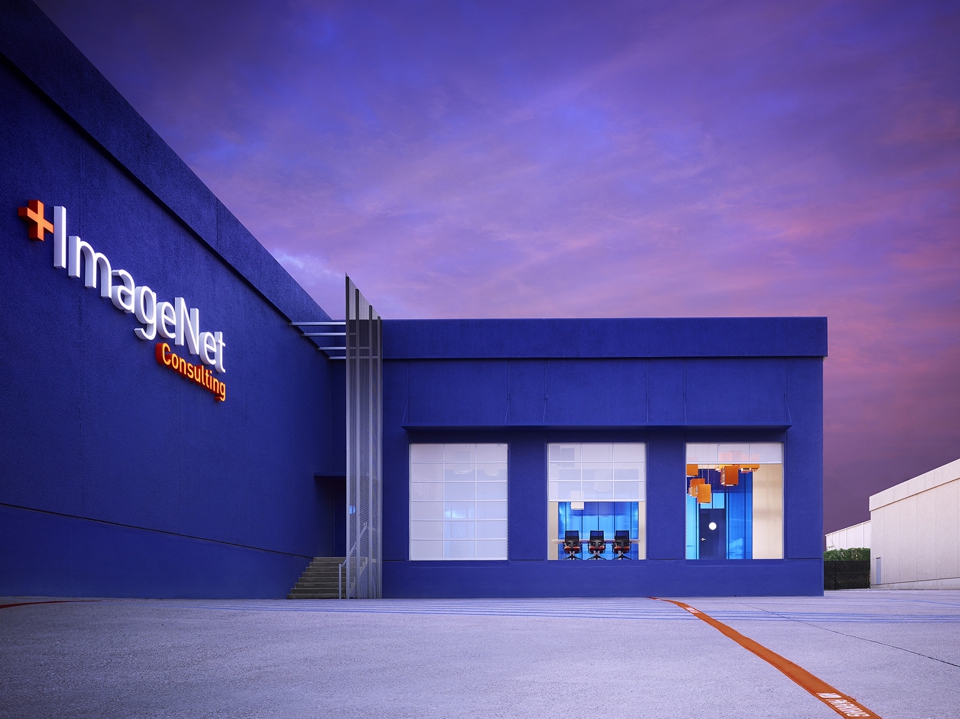
ImageNet Carrollton | Rand Elliott Architects
Contractor: Lingo Construction Services
Photography By: Scott McDonald, Gray City Studios
The project inspiration is a belief that one can repurpose waste into art. The space is created as a series of experiences and exhibits that tells a story of how digital information technology can change our attitude about repurposing waste. The project artfully repurposes materials destined for the landfill – a cloud made of pre-owned filing cabinets, repurposed foam packing material used as a sculptural wall finish, glossy black bubble mailers repurposed as a wall finish and acoustical surface, and a celestial ceiling of recycled toner cartridges. The remodeled space provides the customer an office tour that exhibits and explains ImageNet company policies and processes and provides a powerful tool for client communication. They not only hear who you are but they also see who you are. ImageNet becomes more than a supplier – they become a partner in the pursuit of excellence.
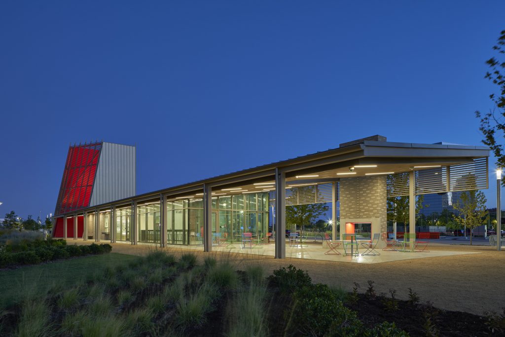
Scissortail Park Café | Butzer Architects and Urbanism
Contractor: Downey Contracting
Photography By: Tim Hursley
The architecture and landscape architecture of Scissortail Park take their inspiration from the pre- historic and contemporary landscapes leading up to the 1889 Oklahoma Land Run. Native grasses, plants, and trees present in the landscapes of the 1880’s are reintroduced along water features and around land formations that evoke the cuestas of the Pre-Cambrian Arbuckle Mountains in southern Oklahoma. The tectonics of the architecture are inspired by the frames and hides used in Plains Tribes’ shelters and serve as a form of “Land Acknowledgment” that recognize this park is built on Native American lands. Steel, wood, and glass become the material palette for this skeleton/skin dialectic. Earthen structures of early Western settlers are the historical source for the brick that rises up to meet the lightweight canopies. The brick colors and patterns evoke the coyote, gray wolf, and deer, and help camouflage the park architecture amidst the regionally inspired landscape. The 360-degree organizations of Scissortail Park Café and its fellow park pavilions engage people from diverse backgrounds, lifestyles, and all directions. As their z-axis, the red lantern of Scissortail Park Café anchors both the memory of that fateful night in 1889, and today’s hope for this reemerging multicultural community.
Oklahoma Contemporary Arts Center | Rand Elliott Architects
Contractor: Smith & Pickel Construction
Photography By: Scott McDonald, Gray City Studios
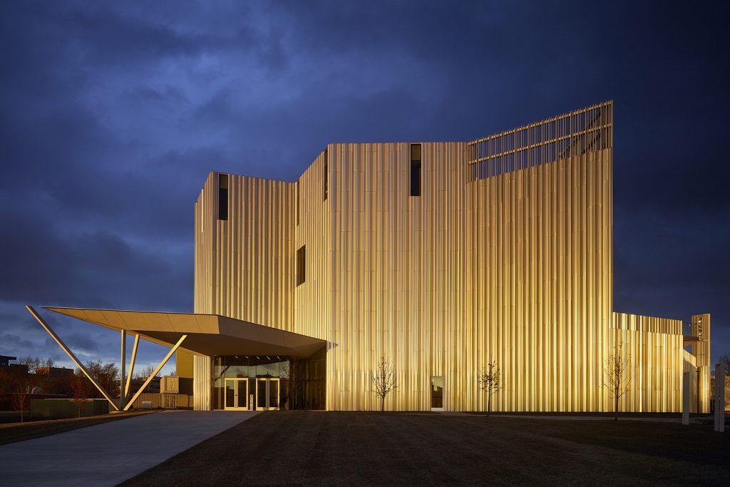
Oklahoma Contemporary’s new downtown campus stands as a sculptural expression of the nonprofit’s mission to provide accessible, inclusive arts experiences. The 53,916 square-foot, four-story building, “Folding Light,” anchors the 4.6-acre campus which includes a renovated 1910 historic warehouse and a three-block arts park. The unique exterior shell is constructed from recycled bright-dipped aluminum, resulting in an ethereal facade designed to capture the state’s ever-changing weather conditions, reflecting, and embracing the dramatic changes in light and sky that characterize the local landscape.
MERIT AWARDS
Central Exchange | Allford Hall Monaghan Morris
Contractor: Lingo Construction Services
Photography by: Eric Schmid
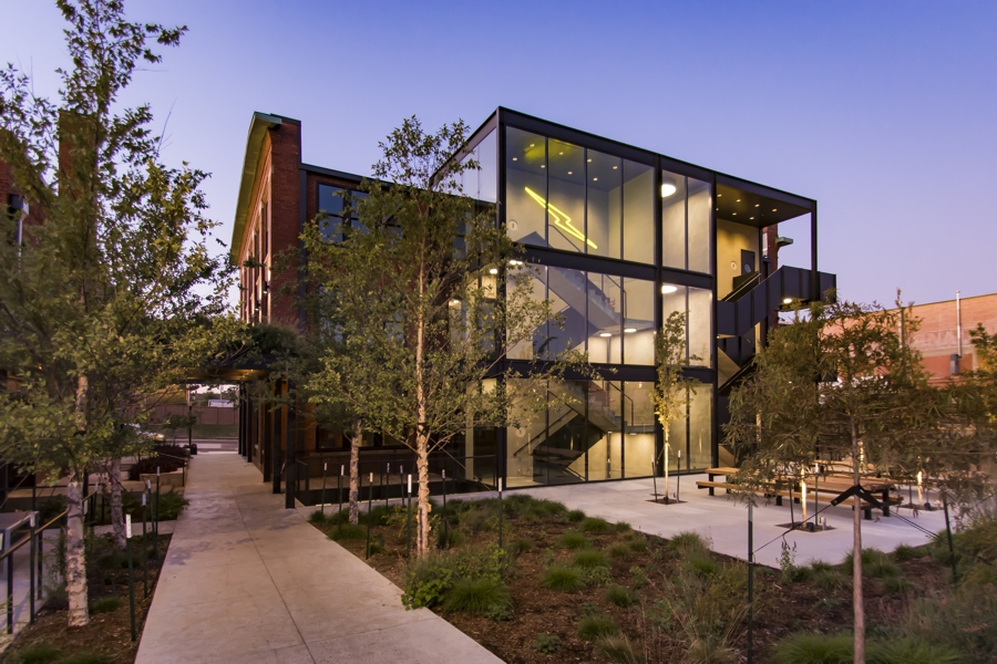
Central Exchange reinvents a pair of robust but derelict historic buildings in Oklahoma City—originally warehouse and garage for the Pioneer Telephone Company—into flexible space for restaurants, coffee shop, retail and office. To exploit their intrinsic character, the buildings are stripped back to their concrete frame and structural brick shells. On the warehouse building lightwells are cut into the floor slab, which, combined with large perimeter windows draw natural light deep into all four tenant floors. A new addition on the north denotes entrance while the expressed stairs connect the floors and stimulate chance interactions. A modern canopy extends from a new north addition providing cover while physically connecting the historically separated buildings. The new layout accommodates a pinwheel of activity arranged around a central promenade acting as both circulation and social core.
Oso on Paseo | Allford Hall Monaghan Morris
Contractor: Modus Construction
Photography By: Timothy Soar
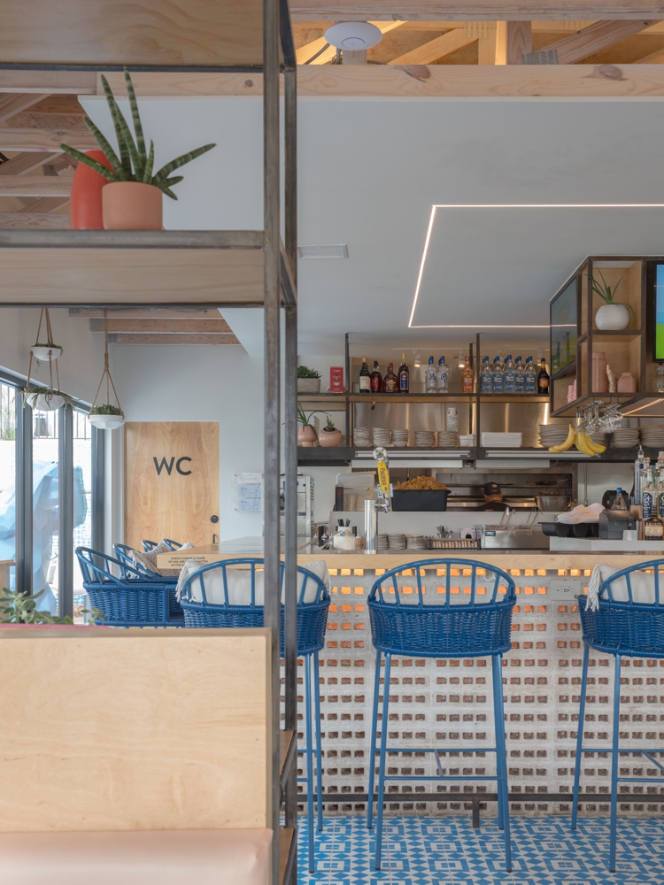
Oso on Paseo is the newest addition to the thriving arts community of the Paseo District in Oklahoma City, Oklahoma. Located at the main entrance to a popular mixed commercial complex, the new architectural pergola frames and activates the patio space with shade for pedestrians to enjoy year round. Designed with every square inch in mind, Oso has maximized its end use 5 times that of neighboring restaurants. Up close detailing and a walkable urban feel are essential to the design with visual connections to the Paseo from every seat. At night, Oso has become a beacon to the district. Large windows are filled to the brim with energy that spills out into the surrounding area. Inside the restaurant, the central bar is the main focus. Constructed out of white bricks, exposed core holes create a veil and add a play of light and depth to the bar. Oso’s material palette echoes the craft food concept with dark patinaed steel shelving, white-washed ceiling rafters, and handcrafted plywood details. Blue encaustic floor tiles line the bar area while the chosen color is repeated again in furniture and in the restrooms that feature blue-grouted tile.
CITATION AWARDS
Donald Betz STEM Research and Learning Center | Rand Elliott Architects
Contactor: Lippert Bros., Inc.
 Bro
Bro
Photography By: Scott McDonald, Gray City Studios
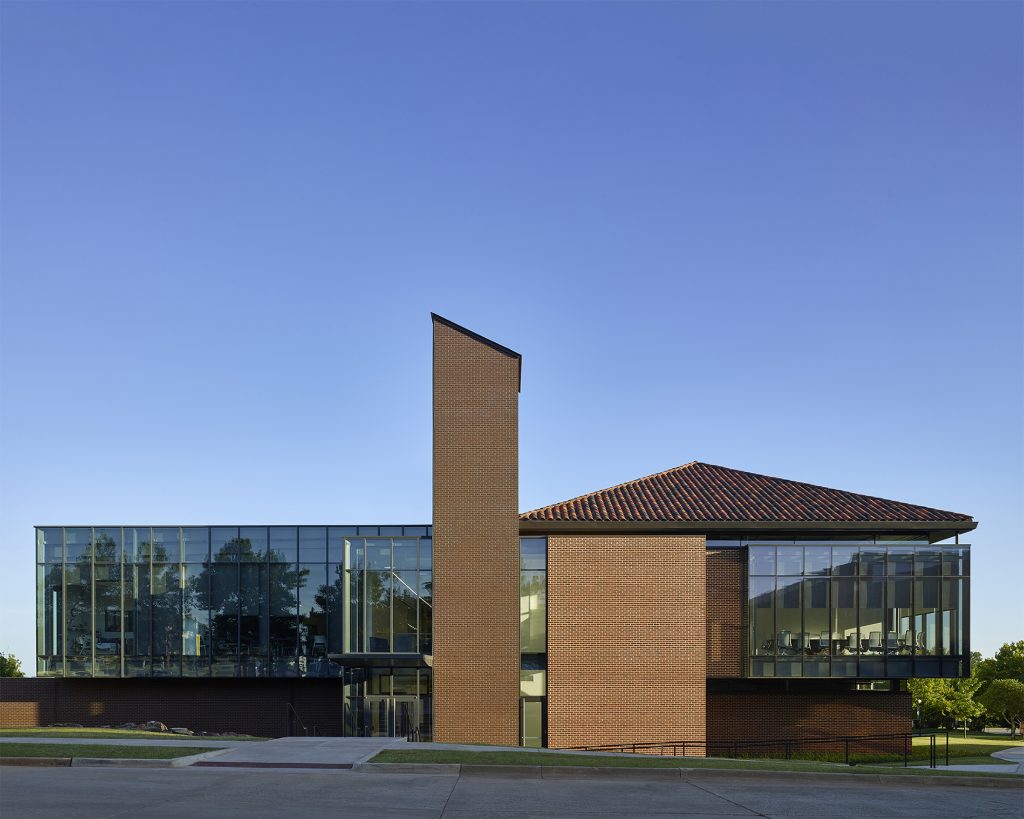
The Donald Betz STEM Research and Learning Center is a 53,000 SF facility that builds on established and growing programs within UCO’s College of Math & Science. The intent of the Center was to create dedicated space to foster connections between disciplines within the college. Every inch has been designed with collaboration in mind. Architecturally, we needed to capture the history of the campus, yet also make a statement about the future. The “Now and Then” concept creates two dualities – a connection to the historic campus on the west and a vision of today and the future on the east. Inside, bright reflective floors give way to high, open ceilings. An interior atrium slices through the building 36’ high and skylights fill the space with ever-changing reflective energy. In developing our concept, we envisioned science and math as an abstract puzzle, the layering of information, and “clues” hidden in plain sight. A “thread” appears through the building leading visitors by labs and classrooms. Each lab possesses a unique feature – interactive glass walls, encouraging students and faculty to peer inside. Ultimately, the Center was designed to offer the millennial student an experience that stimulates creative thinking and inspires innovation.
Oklahoma State Capitol Visitor’s Entrance | FSB Architects & Engineers
Contractor: Manhattan Construction
Photography By: Simon Hurst Photography
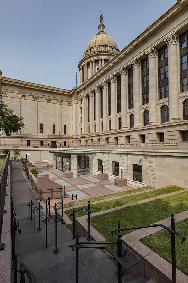
The transforming of the State Capitol’s lower level into the primary public entrance brings a long-range vision to life and addresses the goals and objectives of security, accessibility, improved flow and aesthetics, and an overall positive visitor experience. The exterior plaza includes limestone and granite detailing, offering a park-like feel with terraced seating where visitors and students can gather, learn and have lunch outside. Great care was taken to keep the mature elm and oak trees as well as to integrate the landscape with the exterior design. The new lobby is a grand and appropriate entry to Oklahoma’s most significant cultural building. Upon entering through the glass roof vestibule, guests are met with an Oklahoma state map inlayed in the floor with each county cut out of marble like a puzzle. Illuminated by skylight, the new entrance allows a view of the historic building at the point of transition between the new and old. Continuing through the interior, visitors check in via an updated security area with new equipment and faster processes to shorten lines. Greeted by The Guardian statue and guided by an information station, visitors can browse historic displays located within the waiting area.
OSU School of Architecture Gallery Walls | Rand Elliott Architects
Contractor: Centennial Contractor Enterprises, Inc.
Photography By: Rand Elliott, FAIA
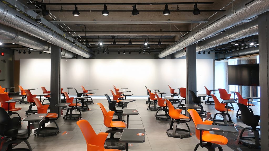
Our client for this project was the OSU School of Architecture. Their desire was to upgrade the existing presentation gallery which was no longer functional for their current needs. A main concern was to leave the floor untouched as the tiles were no longer available. We wanted to illustrate to the students that seemingly boring problems can be transformed into a powerful architectural statement when solved creatively. To remain elevated off the floor, our solution was to attach a tube steel truss to existing columns and to cantilever off each end. To further emphasize that the wall does not touch the floor, an LED light (with integrated receptacles) was mounted on the bottom cord of the steel truss, creating the visual effect of a “floating wall.” The white, back painted magnetic marker board was installed to be used for student presentations. The wall is writable, magnetic, cleanable and durable. From behind, the truss is infilled with recycled denim acoustic insulation that functions as a sound trap for the room. The result is that the white walls became light reflectors that adds new energy to the space.
PEOPLE’S CHOICE AWARDS
Central Exchange | Allford Hall Monaghan Morris
Contractor: Lingo Construction Service

Photography by: Eric Schmid
Central Exchange reinvents a pair of robust but derelict historic buildings in Oklahoma City—originally warehouse and garage for the Pioneer Telephone Company—into flexible space for restaurants, coffee shop, retail and office. To exploit their intrinsic character, the buildings are stripped back to their concrete frame and structural brick shells. On the warehouse building lightwells are cut into the floor slab, which, combined with large perimeter windows draw natural light deep into all four tenant floors. A new addition on the north denotes entrance while the expressed stairs connect the floors and stimulate chance interactions. A modern canopy extends from a new north addition providing cover while physically connecting the historically separated buildings. The new layout accommodates a pinwheel of activity arranged around a central promenade acting as both circulation and social core.
Marland Building – Edward Jones Office Renovation | MA+ Architecture
Contractor: Jodi R. Cline, AAMS
Photography By: Simon Hurst Photography
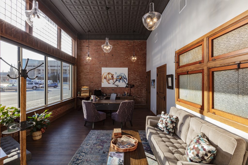
The Marland Building in Ponca City, Oklahoma was met with excitement when it opened as a retail and office property in 1923. The earlier success of the Three Sands and Burbank oil fields meant major economic development in Northern Oklahoma and this new building provided much needed space for local businesses to thrive. Over the decades, the once beloved building fell into disrepair. Today, Jodi Cline is the proud owner of this historic landmark whose mission it is to restore the building to its original splendor. Cline’s Edward Jones office was located in the northeast corner of the 1923 Marland Building in Ponca City from 2004 until April of 2019. Cline purchased the 14,000 square foot Historic Marland Building in 2015 and quickly got to work on plans to renovate a 2,000 sf space on the southeast corner of the building. The boarded-up second floor contained 1930’s era clothing left on hangers, antique appliances, and loads of memorabilia. It took nearly two months to clear the space of debris and several repairs would need to take place before the Edward Jones team could officially move into the space.
The Monarch Office Building | Fitzsimmons Architects
Contractor: Lingo Construction Services
Photography By: Justin Miers
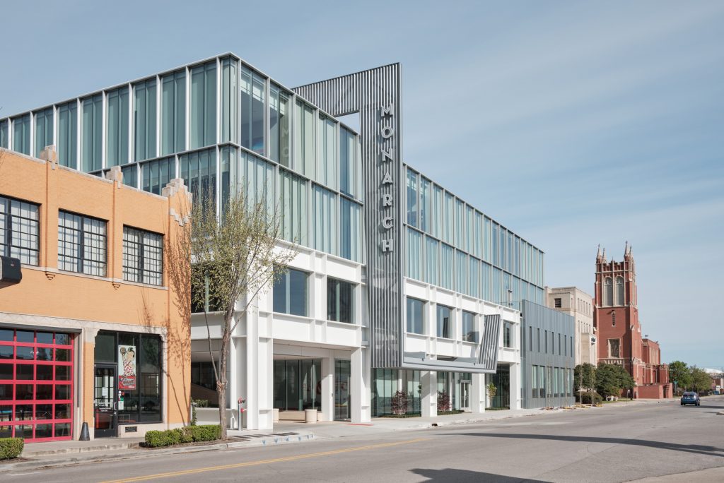
The Monarch is a continuance of place-based, urban infill in Midtown from The Guardian Lofts on N. Robinson Avenue to Plaza Court on N. Walker Avenue. The 4-story glass, steel, and masonry office building responds to the City grid and surrounding building heights, creating a harmonious and human-scale pedestrian experience. Higher floors are stepped back on an orthogonal grid with expansive glass, giving pedestrians the feel of walking down a street lined with two-story buildings and creating a distinct presence within the growing skyline. The Monarch is in the center of OKC’s growing creative and high-tech community and part of Midtown’s connection to the Innovation District. It sets the tone and expectation for the quality of future ground-up infill development in the neighborhood. The Monarch leverages its location a half block from an OKC Streetcar stop and within walking distance of several restaurants and shops. The location is very walkable, bikeable, and drivable. Perhaps the most interesting challenge was inclusion of, and access to, a parking structure that does not detract from the streetscape, yet provides adequate parking for The Monarch, The Guardian, and the next pad site on Harvey Avenue. We took advantage of the site slope to slip in two levels of parking.
Positive Tomorrows | MA+ Architecture
Contractor: GE Johnson Construction Company
Photography By: Simon Hurst Photography
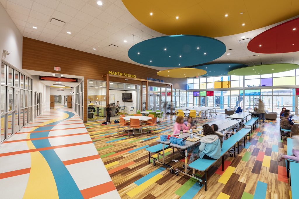
Positive Tomorrows is Oklahoma’s only tuition-free elementary school and social service agency serving families experiencing homelessness. With roughly 1 in 10 students in the Oklahoma City Public School System facing homelessness, the services Positive Tomorrows provides to the community is vital to breaking the cycle of homelessness and poverty. Formerly housed in a church annex with limited space, Positive Tomorrows turned away nearly 100 students each year. They needed additional space if they were to serve more families. MA+ Architecture became involved with Positive Tomorrows in 2013 and with funding through a Building Success Campaign in 2017, began designing a new 42,000 SF facility that would triple capacity and extend the school’s student services to Early Head Start – 8th grade. The new space enhances the structure and stability Positive Tomorrows students and their families need through specialized learning spaces, upgraded safety and security measures, and additional Family Support areas.
“The Branch” OC Student Dining Facility | GSB, Inc.
Contractor: Smith & Pickel Construction
Photography By: Kerry Azzarello
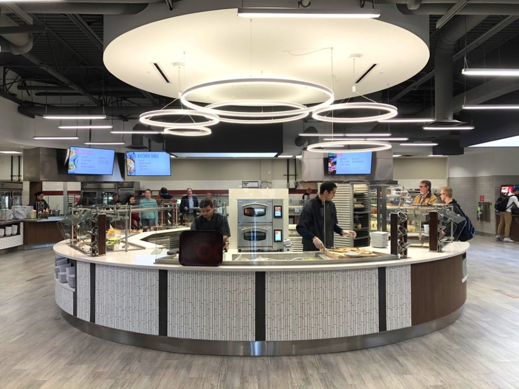
This $4,800,000 addition and renovation project provides a purpose-built dining venue to replace a university ballroom used as a dining hall for over 25 years. The project includes an entirely new multi-venue servery, offering numerous made-to-order entrees at each meal, as well as stations for self-serve salads, desserts, beverages, breakfast foods and pre-made items. It also includes an entirely new dishwash area. The dining area includes a large, informal space with dramatic views, a private dining room, and a semi-private room. The dining facility expands the Gaylord Student Center, which was originally built in the 1950’s, and connects to the existing kitchen. The design responds to the building orientation to maximize natural daylight, while limiting solar heat gain. Large north and northwest facing storefront windows offer indirect light, while west facing windows are intentionally limited. The serving lines could not accommodate windows, so skylights were employed to introduce indirect natural daylight. Resilient finishes provide durability for high traffic, while offering an attractive appearance. A variety of seating options, with readily available power outlets, comfortably accommodates single students to groups of 12 or more for dining, study or socializing. Attractive and thoughtfully designed signage and graphics are placed throughout the facility.
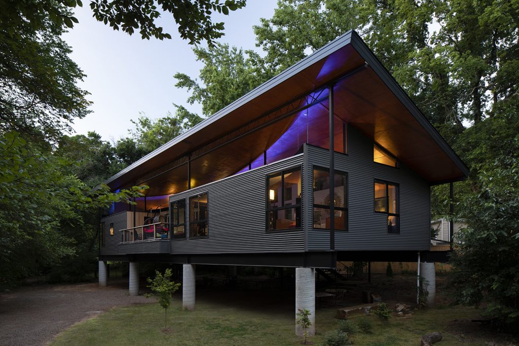
The Arc | Alan Moring, AIA
Contractor: Alan Morning
Photography By: Mel Willis
This is a tree house and a hideout. One mile east of campus, our home is perched on the banks of Bishop Creek, nestled in the trees away from the street. The design is very open. The only interior doors are for the two toilet rooms. Those rooms are also the only ones that have partitions that extend to the ceiling. I prioritize quality of materials and design over size or grandeur. It is unlike anything built in Oklahoma. Modern aesthetics wrap a warm interior with abundant natural light and warm material.
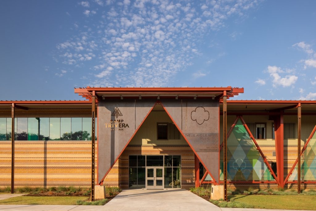
Girl Scouts Western Oklahoma Camp Trivera | REES
Contractor: Lingo Construction Services
Photography By: Mel Willis
Girl Scouts Western Oklahoma’s Camp Trivera is set on 17 acres in Oklahoma City’s Adventure District, across the lake from the Oklahoma City Zoo. A two–story lodge provides offices, flexible 350-seat event space, a STEM room, a trading post, a covered porch and three fireplaces. Bunk-style rooms and comfortable community living areas are found on the second floor. The Scouts dreamed up bunkroom themes, from caverns to whimsical forests, which were brought to life with custom-made wall coverings. Outdoors, you will find a campfire and amphitheater, pool, three treehouses, two campsites, zipline, walking trails and kayaking access to Northeast Lake. STEM features are abundant. For example, the pool is 10 feet deep, so the girls can work with underwater robots. A pulley system helps campers bring their luggage up to the bunk rooms. As scouts climb up the rock wall, labels point out different layers of rock in the earth’s surface. Exterior bricks were layered with a geology lesson in mind. Camp Trivera is one of eight STEM Centers of Excellence within the Girls Scouts of the U.S.’s system and will help put 2.5 million girls into the STEM workforce by 2025.
The Carlisle Indian School Project | New Fire Native Design Group
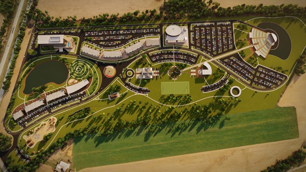
Image By: New Fire Native Design Group
Opened in 1879 in Pennsylvania, the Carlisle Indian Industrial School was the first government-run boarding school for Native Americans. This project envisions a permanent place to honor the legacy of the thousands of Native children from more than 140 tribes who attended the Carlisle Indian Industrial School during its 39 years of operation. Visitors will be immersed in the students’ stories, be able to tour the School grounds and learn about the extraordinary influence Carlisle students have had in the areas of athletics, art, music, military and more. Visitors will also uncover the full story, both good and bad, of the Indian boarding school era and its impact on generations of Native peoples. The walkable 80-acre site will include both recreational and educational opportunities featuring a museum and heritage center, a traditional demonstration village, a hall of fame, dance grounds, a hotel and convention center, restaurants and retail space. The heritage center will be where visitors, native and non-native alike, can learn about Carlisle Indian Industrial School, the stories of its students and experience healing and understanding of the boarding school system.
Scissortail Park Cafe | Butzer Architects and Urbanism
Contractor: Downey Contracting

Photography By: Tim Hursley
The architecture and landscape architecture of Scissortail Park take their inspiration from the pre- historic and contemporary landscapes leading up to the 1889 Oklahoma Land Run. Native grasses, plants, and trees present in the landscapes of the 1880’s are reintroduced along water features and around land formations that evoke the cuestas of the Pre-Cambrian Arbuckle Mountains in southern Oklahoma. The tectonics of the architecture are inspired by the frames and hides used in Plains Tribes’ shelters and serve as a form of “Land Acknowledgment” that recognize this park is built on Native American lands. Steel, wood, and glass become the material palette for this skeleton/skin dialectic. Earthen structures of early Western settlers are the historical source for the brick that rises up to meet the lightweight canopies. The brick colors and patterns evoke the coyote, gray wolf, and deer, and help camouflage the park architecture amidst the regionally inspired landscape. The 360-degree organizations of Scissortail Park Café and its fellow park pavilions engage people from diverse backgrounds, lifestyles, and all directions. As their z-axis, the red lantern of Scissortail Park Café anchors both the memory of that fateful night in 1889, and today’s hope for this reemerging multicultural community.
COTE AWARD
Central Exchange | Allford Hall Monaghan Morris
Contractor: Lingo Construction Services

Photography by: Eric Schmid
Central Exchange reinvents a pair of robust but derelict historic buildings in Oklahoma City—originally warehouse and garage for the Pioneer Telephone Company—into flexible space for restaurants, coffee shop, retail and office. To exploit their intrinsic character, the buildings are stripped back to their concrete frame and structural brick shells. On the warehouse building lightwells are cut into the floor slab, which, combined with large perimeter windows draw natural light deep into all four tenant floors. A new addition on the north denotes entrance while the expressed stairs connect the floors and stimulate chance interactions. A modern canopy extends from a new north addition providing cover while physically connecting the historically separated buildings. The new layout accommodates a pinwheel of activity arranged around a central promenade acting as both circulation and social core.
STUDENT AWARD WINNERS
From the University of Oklahoma, COLE MOHEDANO for R.O.S.A. Research Outpost for Sustainable Architecture.
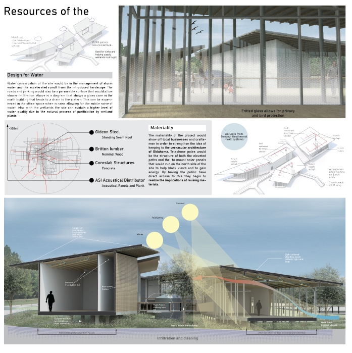
From Oklahoma State University, JACEY WATSON for the Culinary Arts Laboratory.

2020 AIA Architecture Week Sponsors:
PLATINUM SPONSORS
Bell & McCoy Lighting and Controls
ES2
JE Dunn Construction
Lippert Brothers
Pella Windows & Doors of Oklahoma
Smith Lighting Sales
GOLD SPONSORS
Acme Brick
Guernsey
Manhattan Construction
A.C. Owen Construction
Premier Lighting Sales
SILVER SPONSORS
Boldt Construction
Bryan’s Flooring
CMSWillowbrook Construction
Key Construction
MA+ Architecture
Miller Tippens Construction
Nabholz Construction
TAP Architecture
Timberlake Construction
TRW Oklahoma
TScott Construction
Wallace Engineering
BRONZE SPONSORS
Olsson
Rick Scott Construction
Smith & Pickel Construction
